PortSwigger Account Redesign
Problem: The PortSwigger account was visually misaligned with other product offerings, and users experienced challenges with navigation and finding essential information. The bounce rate was higher compared to other pages.
Role: UX Designer
Team: Customer Experience, Content Writers, Software Developers.
Tools: Figma, Miro, Lyssna (formerly Usability Hub)
Duration: 3 months

Business Objectives
Align with the other product pages.
Improve the overall user experience.
Prepare for future features like PortSwigger Cloud.

Research
From a quantitative perspective, I analysed key metrics such as bounce rate, user navigation paths (where users came from and where they were going), and drop-off points to identify problem areas in the current design.
I then conducted a survey with a card sorting exercise to understand how users mentally categorised different items on the account page. Following up with user interviews.
Key Findings
The primary reason users were accessing their account was to access their license keys and download the software
Users explained to us that it was difficult to navigate between parts of the account and so there was reason to improve the information hierarchy.
Quantitative Analysis
The following data is a sample taken from the 6 months previous from when the project started.

8% of all traffic came to the Account
The average time spent on the Account was 0.56 seconds
It was the 3rd most popular page visited

The split of new and returning users to the Account page.
31% of users were new
69% of users were returning

A breakdown of devices users access the account page with.
92% of users use desktop
7.5% of users use mobile
0.5% of users use tablet
Qualitative Analysis
PortSwigger’s product is quite complex and their users have a very specific skillset and this became a challenge when trying to recruit for user testing. One large benefit, however is that the company has a huge online community. I overcame this challenge by taking the initiative to reach out to the community via Twitter and Linkedin.
I sent out a survey and learn how users would categorise items that can be found in the account. The card sort was open and without set categories in order to alleviate bias and to understand any trends or themes.
Users were then asked if they wished to participate in a call to discuss the Account page further.

The Workshop
I organized a workshop with the CX and Content teams to review user feedback and data findings. The workshop addressed:
User feedback: Discussing common complaints and suggestions from the survey and user interviews.
Data insights: Identifying major problems with the current design, based on the data analysis.
Prioritization: Evaluating the key pain points and potential gains to prioritize improvements.
Key Outcomes:
“How Might We” statements thought of and themed in categories from user pains.
A consensus on the card sorting from users
Initial wireframe skamps/sketches

How Might We…
“How might we improve the visibility and accessibility of key account features like billing and profile updates, ensuring users can easily complete important tasks”
Participants were asked to come to the workshop with user pains and business pains that would be translated into How Might We statements. Using the methods I found on the Nielson Norman group article about shaping HMWs, we were able to condense them into one umbrella statement:
Ideation
Working alongside the CX team, taking the HMW and the results from the card sorting exercise, I was able to solidify a concept for the new side navigation. This was translated into low fidelity sketches and fed back to the team and also to the users that took part in initial interviews.
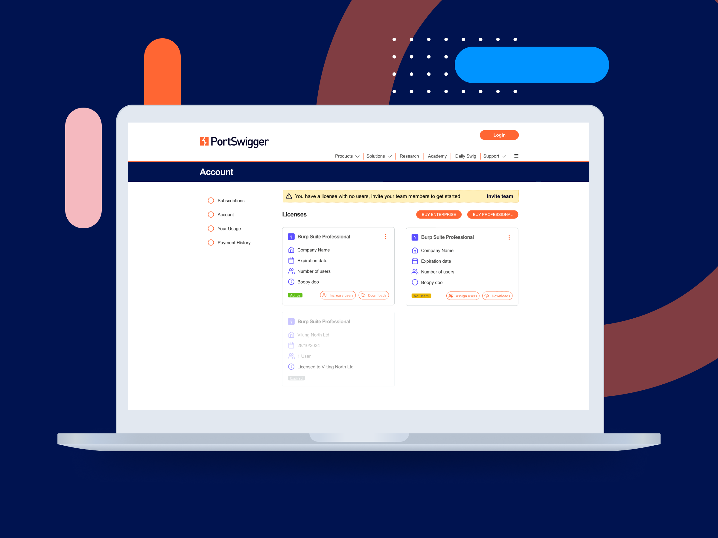
The side navigation was the main feature that was implemented along side the updates to the UI. In order to speed up the development time, a few things were removed for MVP, including the improvements to the Licenses screen that you can see below.
Key Findings
Users that we tested the side navigation with reported that they were able to find what they were looking for much easier. The perceived time it took to complete a task and the time it actually took were much more aligned than previously.
Overall, the objective to improve the visibility and accessibility of the account screen was deemed a success.

What went live


Licenses
The intended amount of time spent on the project was 3 months. Because of this, a UX change that I had proposed: improving how users manage their subscriptions, was deemed out of scope.
The concept of having cards for the licenses was parked and had I more time, I’d have liked to have tested this with users under the hypothesis that “If users are shown licenses in cards, they are more likely to understand how to manage their users, license and software.“
